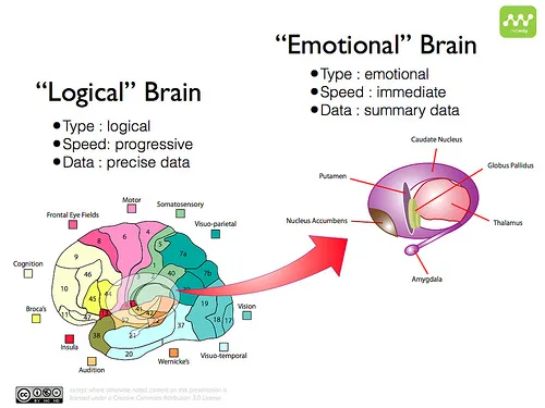
Whenever you design a product, there are two important things that one needs to remember to get the user experience right. How the user is going to perceive the product logically vs emotionally.
The reason I bring up these two are because how our brains have developed over the years. We have a logical part of the brain which has developed over the past 10000 years and then the emotional part of the brain which has been trained and developed over millions of years.
The Emotional part of the brain instantly detects and selects information as summaries that is potentially interesting for further analysis. Whereas the logical brain can only process at a slower rate and progressively but can give precise answers.
Which part of the brain does what?
When we were still in caves, the emotional brain was responsible for quickly looking at the surroundings and identify whether anything interesting (prey) is available. Once it has identified something interesting, it will decide to pursue the prey and use the logical brain to rationalize the decision and go for the kill.
Similarly, in any product or website design, the emotional brain is going to help you to immediately identify patterns and areas in the design which are interesting - like the add to cart button, product image, search bar to find information, etc. Once the interesting areas are identified, it directs the logical brain to go forward with the next steps of buying the product, clicking on the image or typing some keywords in the search box.
The emotional brain also helps in forming memories and using patterns to identify these areas of interest. As you keep using a product you develop a familiarity to using it and trains your emotional part of the brain. This is the brain which helps in creating habits. Thats why everyone hates it when Twitter or Facebook changes the UI.
If the logical brain forms the User Interface and the actions you need to perform any action in your product, the emotional brain is the one which takes care of the User Experience of the product. If you constantly feel frustrated using a product, just remember that the designer didn’t care about catering to your emotional brain.
What do you mean by designing for the emotional brain?
To understand how we connect emotionally with a product lets see an example with multiple variations of Login screens. We have used lot of products which use a screen to login. There are utmost two variations.
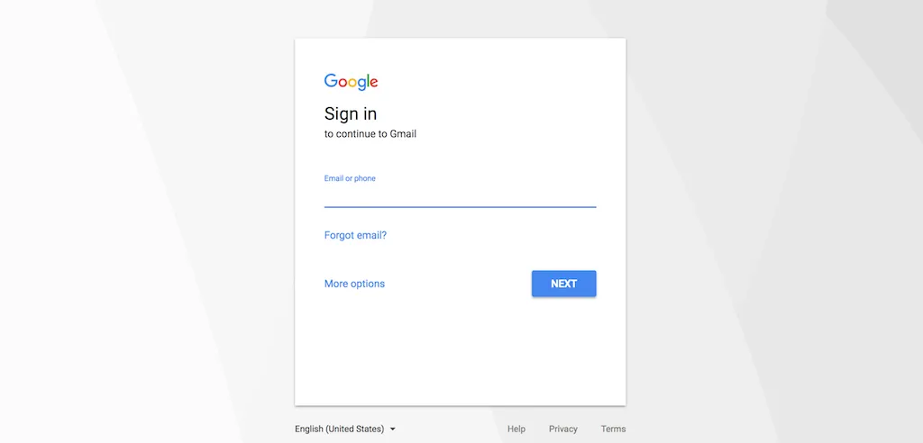
Variation 1: The page has just the login form in it with the text boxes and buttons in the middle. Popular example: Gmail login page.
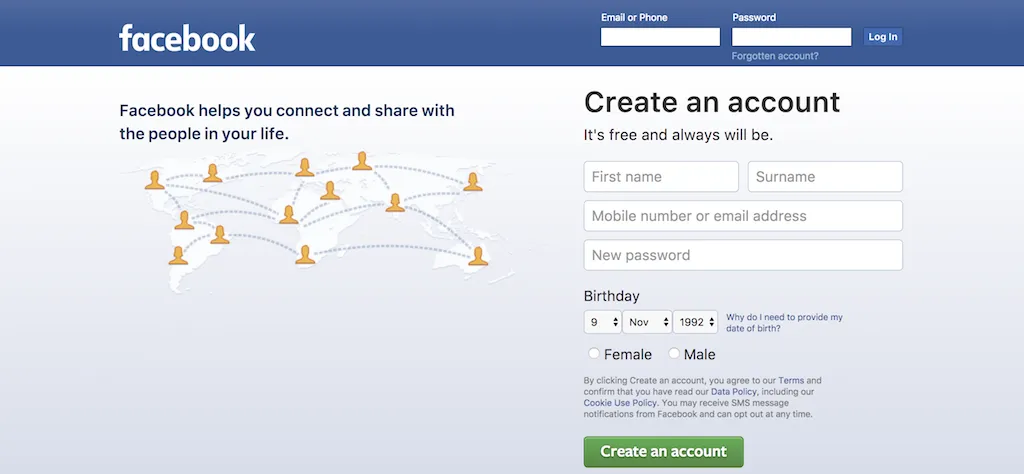
Variation 2: Another pattern is the login elements at the right side of the page. Popular example: Facebook. It has the login form at the top right and the registration form at the right.
Lets assume you are a new and upcoming designer and wants to come up with a radical new way of designing login screens.
You change the login form to the left side. The users will not be able to identify it as a login page. It causes unwanted cognitive dissonance.
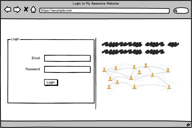
Even worse are login pages which include an image. Like the one below. There is nothing wrong in having an image at the left. But if the image contains a human face the human brain automatically focusses your attention towards the image.
There are numerous eye tracking experiments and research done on this. By just adding a human face in the login screen, you have caused an unnecessary contest between two elements in your page.
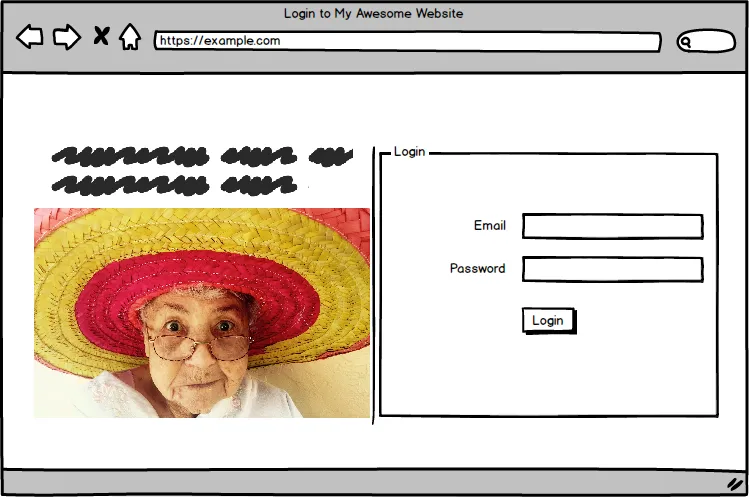
Even worse, would be if the subject in the image gazes away from the intended action area (the login screen in our case). Human brains naturally track where the subject is looking at and follow it. So you can try having a subject look at the login form to improve conversions and make him look away to decrease conversions. In the below eye tracking test, since the baby is looking at the headline, users are driven to read it. ![]()
Whereas in this image, the users don’t care much about the headline and copy on the screen.

If the subject is looking away from the main copy or headline or form, I wish you all the best trying to make the user perform the action intended.
There is only one more design which can beat it at being the worst possible login screen. If you replace the left size image with an animated video. Videos are distracting as hell and needs to be used at the right places. Pasting videos all over your product is only going to increase the user’s frustration.
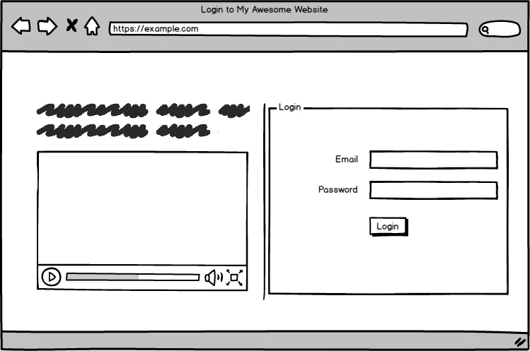
All these affects the emotional part of our brain and causes our brain to get confused over which area in the page is interesting. Eventually the user would get frustrated about the product and end up not using it at all. Just imagine if this is what happens for a simple login screen, what would be the case for a landing page or a dashboard screen which the user needs to use everyday?
When you design your next product or screen, remember these points and design for the emotional brain too. Only by understanding the emotional part of the product, you can make sure the user doesn’t get frustrated to use your product.
